XYLD vs QYLD: 8 Years of Distribution Income
XYLD and QYLD are both covered-call ETFs built to generate income, but their income journeys since 2018 have looked surprisingly different.
One way to see that difference is through yield on cost: annual distributions divided by the original share price.
Rather than asking what either ETF yields today, this comparison shows how the income generated by an investment made in 2018 changed over time.
QYLD started with a major advantage. In 2018, its yield on cost was roughly 10%, compared with only about 5.5% for XYLD.
But starting yield turned out to be only part of the story.
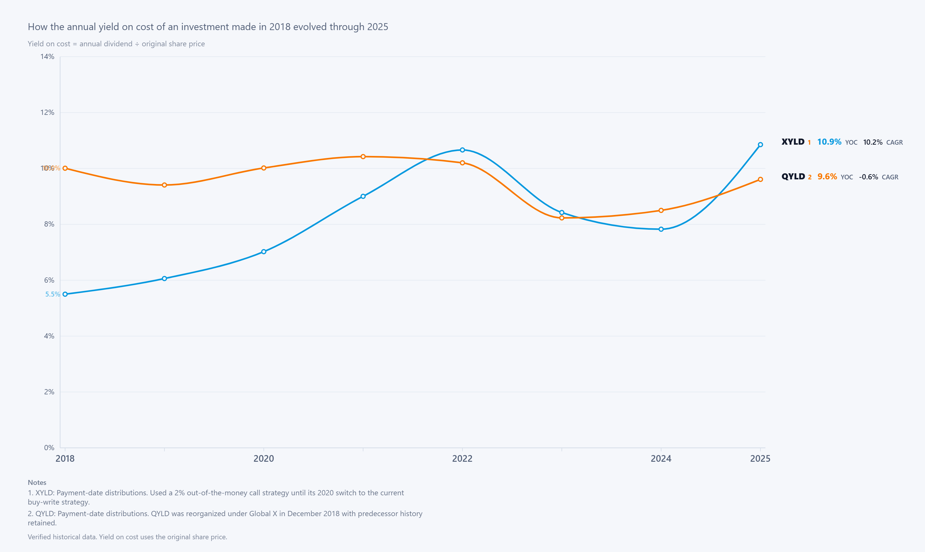
The chart follows the annual yield on cost of XYLD and QYLD from 2018 through 2025.
XYLD's income climbed rapidly during the first several years. Its yield on cost increased from roughly 5.5% in 2018 to around 7% in 2020, 9% in 2021, and nearly 11% by 2022.
QYLD followed a much flatter path. Its yield on cost remained around 10% through much of the early period, but it did not produce the same sustained income growth.
By 2023, QYLD's yield on cost had fallen to roughly 8.2%.
There is also important historical context behind the two lines.
XYLD used a 2% out-of-the-money call strategy until switching to its current buy-write strategy in 2020. QYLD was reorganized under Global X in December 2018, with its predecessor history retained.
So the chart represents the actual historical income journey of these investments, but the strategies and fund structures were not completely unchanged throughout the period.
XYLD's path was not consistently upward either. After reaching nearly 11% yield on cost in 2022, its distributions declined significantly, pushing yield on cost below 8% by 2024.
Then the picture changed again in 2025.
XYLD's annual distribution rebounded to about $5.46 per share, bringing its yield on cost to roughly 10.9%.
QYLD distributed approximately $2.38 per share and finished at around 9.6% yield on cost.
The striking part is where the two funds ended relative to where they began. QYLD started with almost twice XYLD's yield on cost, yet by 2025, XYLD had closed the gap and moved ahead.
Final Takeaway
A high starting yield can be attractive, but it does not tell investors how much income an investment will generate years later.
QYLD delivered substantially more income relative to its original purchase price at the beginning of this comparison. XYLD started much lower and experienced significant ups and downs, but ultimately produced a higher yield on cost by 2025.
For long-term income investors, the practical lesson is to look beyond today's headline yield. Distribution history and how income changes over time can be just as important as where the yield starts.
This is a historical comparison for informational purposes, not a recommendation to buy or sell either fund.
Explore more dividend income comparisons and visual research on DividendXray.