Top S&P 500 Dividend Stocks by Yield, Growth, and Market Weight
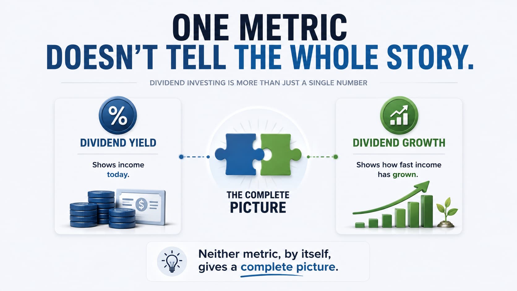
Looking at dividend stocks through a single metric can easily lead to incomplete conclusions.
A high dividend yield may look attractive, while a fast dividend growth rate can suggest strong income growth potential. However, neither statistic tells the full story on its own.
This visual combines both metrics into a single chart while also showing each company's relative size within the S&P 500, providing additional context that individual rankings cannot.
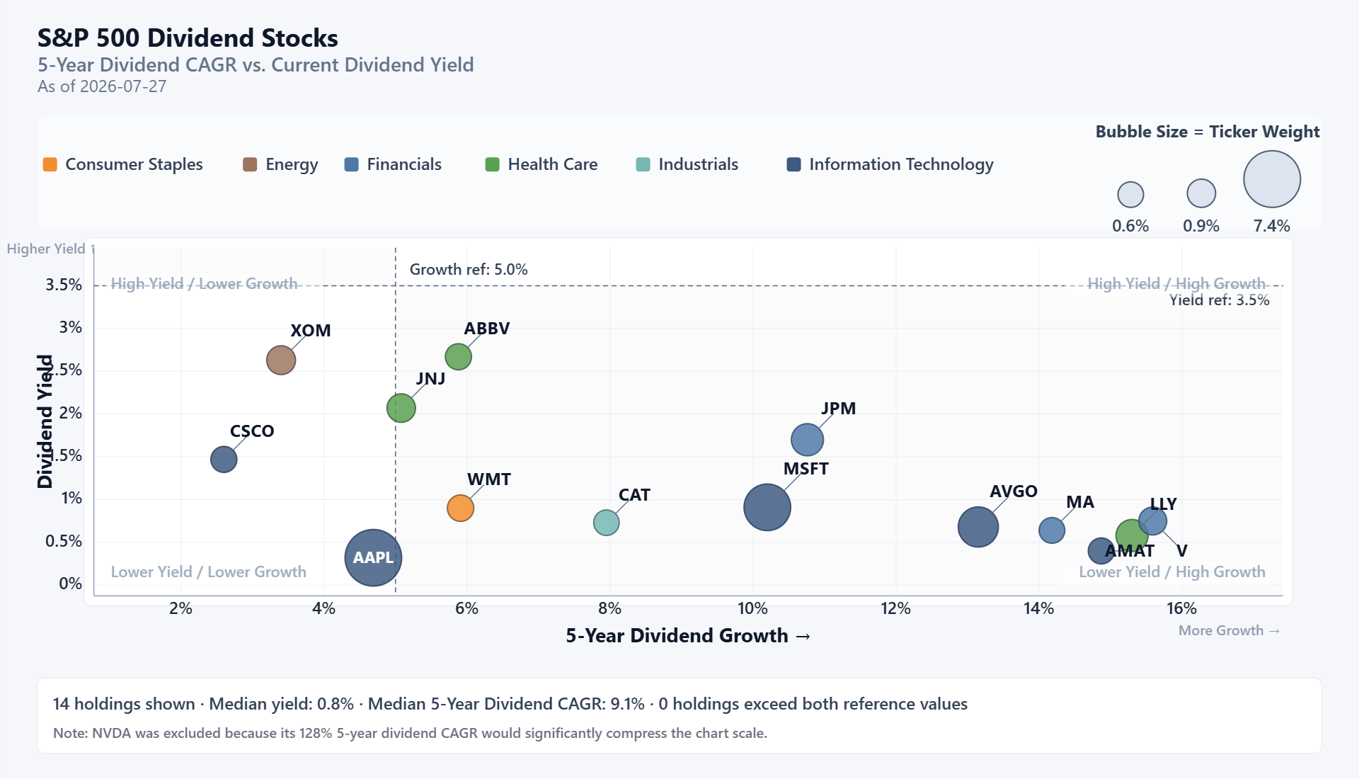
The horizontal axis measures each company's five-year dividend growth rate, while the vertical axis shows its current dividend yield. Bubble size represents the company's weight within the S&P 500, allowing larger index constituents to stand out visually.
One of the most noticeable observations is how widely companies are distributed across the chart. Some businesses provide relatively high current yields but have experienced slower dividend growth over recent years. Others have delivered impressive dividend growth while still offering comparatively modest yields.
Because these metrics measure different characteristics, neither should automatically be considered better than the other. Instead, the chart illustrates the trade-offs investors often encounter when evaluating dividend-paying companies.
It's also worth remembering that both figures are backward-looking. Five-year dividend growth summarizes historical increases rather than predicting future growth, while today's dividend yield can change as companies adjust their dividends or as share prices fluctuate.
Viewing these metrics together provides a broader perspective than relying on a single statistic. Rather than searching for one "best" company, investors can better understand how different businesses balance current income, historical dividend growth, and overall market significance.
Final Takeaway
No single dividend metric can fully describe a company's income profile. Current yield, historical dividend growth, and company size each provide valuable context, and considering them together often leads to a more balanced evaluation.
Charts like this help highlight the trade-offs behind dividend investing and encourage a more comprehensive approach to comparing companies rather than focusing on a single headline number.
If you'd like to explore more dividend visualizations and compare income-focused investments from multiple perspectives, DividendXray offers a growing collection of research tools and interactive charts.