SCHD vs VIG vs DGRO vs VYM vs HDV: Portfolio Overlap & Dividend Income Compared
Most investors compare dividend ETFs using familiar metrics like yield, expense ratio, or historical performance. While those numbers are useful, they don't always reveal how similar two funds really are—or where their dividend income actually comes from.
This analysis looks at five of the most widely followed dividend ETFs: SCHD, VIG, DGRO, VYM, and HDV. By comparing both portfolio overlap and dividend income concentration, investors can better understand whether they're achieving true diversification or simply owning different wrappers around many of the same companies.
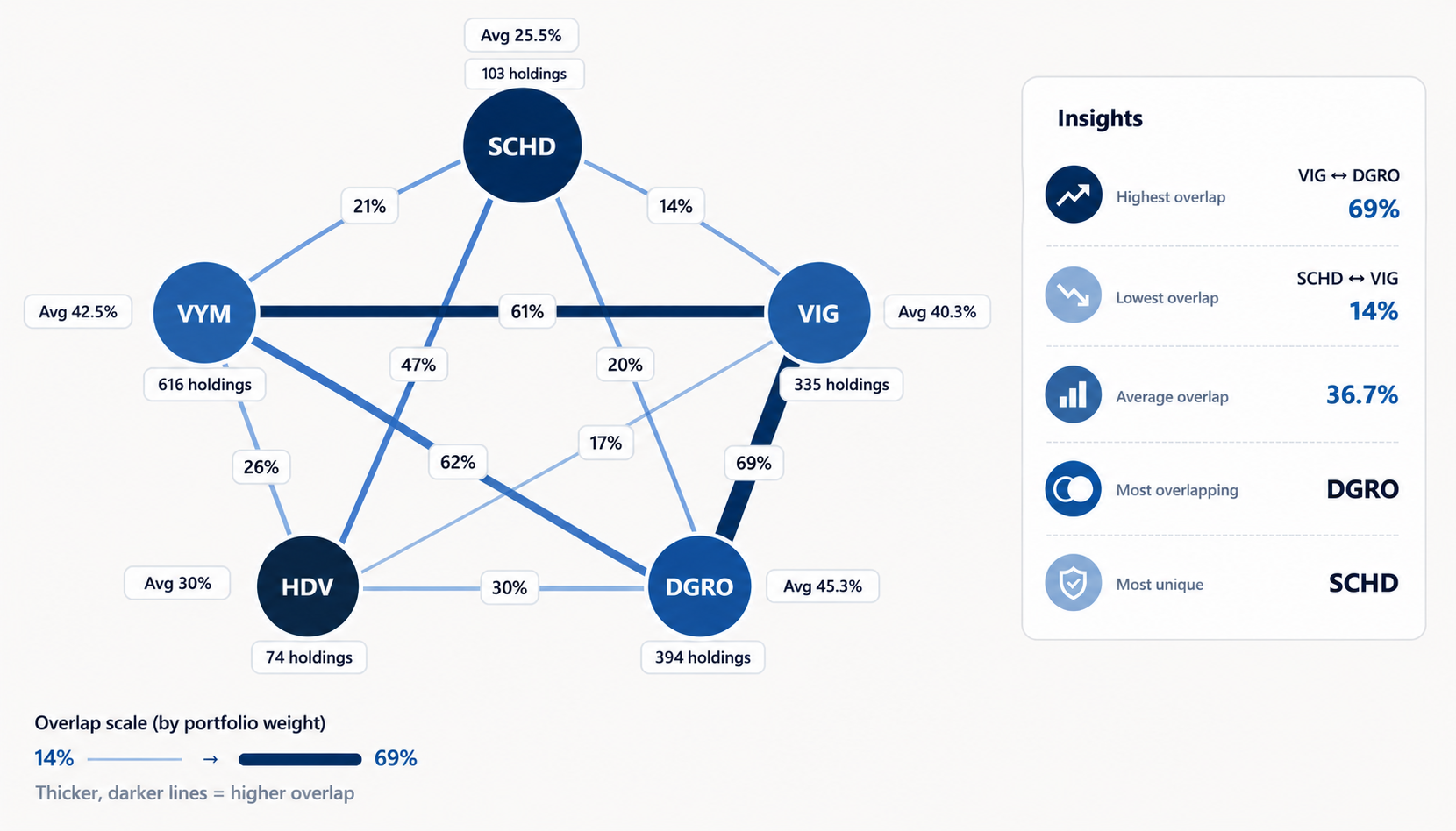
The first chart compares the weighted portfolio overlap between each ETF. Rather than counting shared holdings equally, it considers how much of each portfolio is invested in the same companies.
One relationship stands out immediately: VIG and DGRO share approximately 69% weighted overlap, making them by far the most similar pair in this comparison. Despite tracking different indexes, many of their largest positions are remarkably alike.
At the opposite end, SCHD and VIG overlap by only about 14%, making them the most differentiated combination. Looking across the entire group, DGRO has the highest average overlap with the other ETFs, while SCHD has the lowest, suggesting it provides the most distinct portfolio among these five funds.
Portfolio overlap is valuable because it helps investors identify hidden duplication that isn't obvious from ETF names alone.
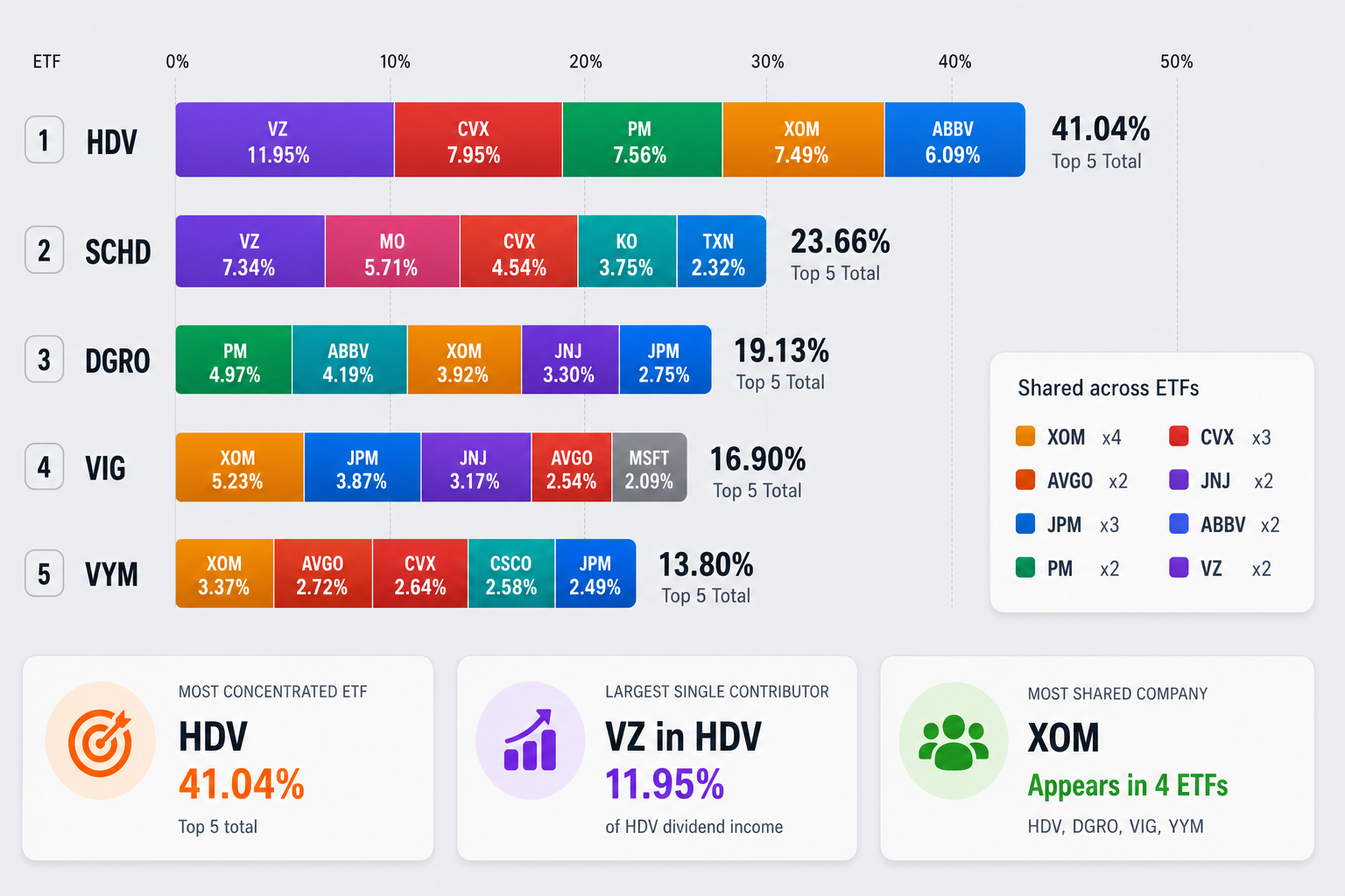
Holding many of the same companies doesn't necessarily mean the dividend income is distributed the same way. The second chart shifts the focus from portfolio weights to the companies generating the largest share of each ETF's dividend income.
HDV stands out as the most concentrated income portfolio. More than 41% of its total dividend income comes from just five companies, meaning a relatively small group of holdings has an outsized influence on its income stream.
SCHD tells a different story. Its top five contributors generate less than 24% of total dividend income, indicating that its income is spread across a much broader collection of businesses.
The chart also highlights several familiar names that appear repeatedly across multiple ETFs. Companies such as Exxon Mobil, Chevron, JPMorgan, AbbVie, Johnson & Johnson, and Verizon contribute meaningful dividend income in several of these funds. Even investors holding multiple dividend ETFs may discover that a significant portion of their passive income ultimately comes from many of the same companies.
Final Takeaway
Yield is only one piece of the puzzle. Portfolio overlap helps uncover hidden duplication, while dividend income concentration reveals which companies are truly driving your cash flow.
Looking at both perspectives together provides a much clearer understanding of how dividend ETFs differ and can help investors build a more intentional income portfolio.
If you'd like to analyze your own portfolio using these same visual insights, explore DividendXray.