Where SCHD's Dividend Income Really Comes From
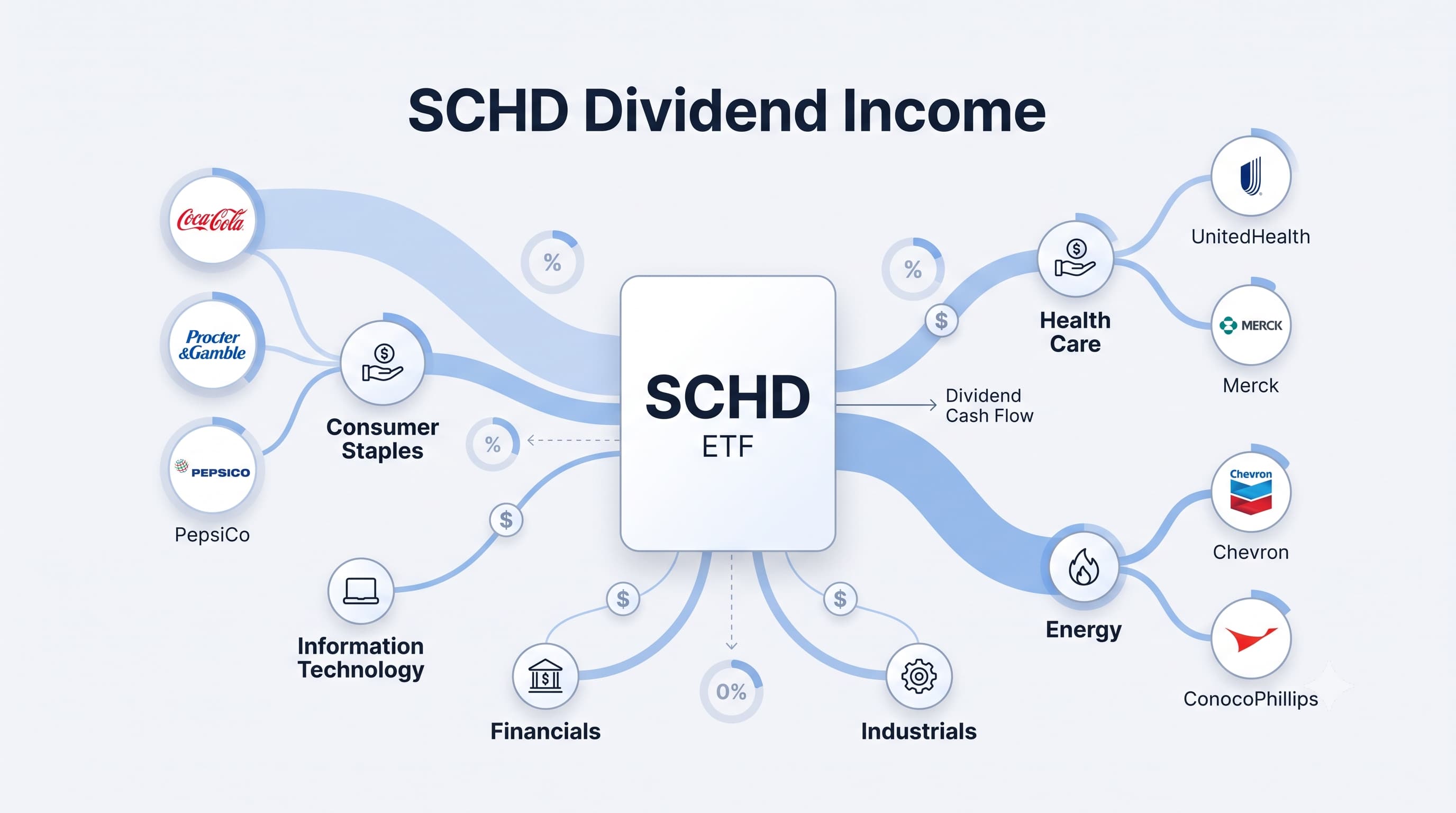
Dividend investors often evaluate ETFs by looking at sector allocation or overall dividend yield.
While both metrics are useful, they don't fully explain where an ETF's cash distributions actually come from. Dividend income depends on two factors working together: how much capital is invested in each company and the dividend yield that company pays.
This analysis looks at the Schwab U.S. Dividend Equity ETF (SCHD) from an income perspective, revealing which sectors and companies generate most of the fund's estimated dividend income.
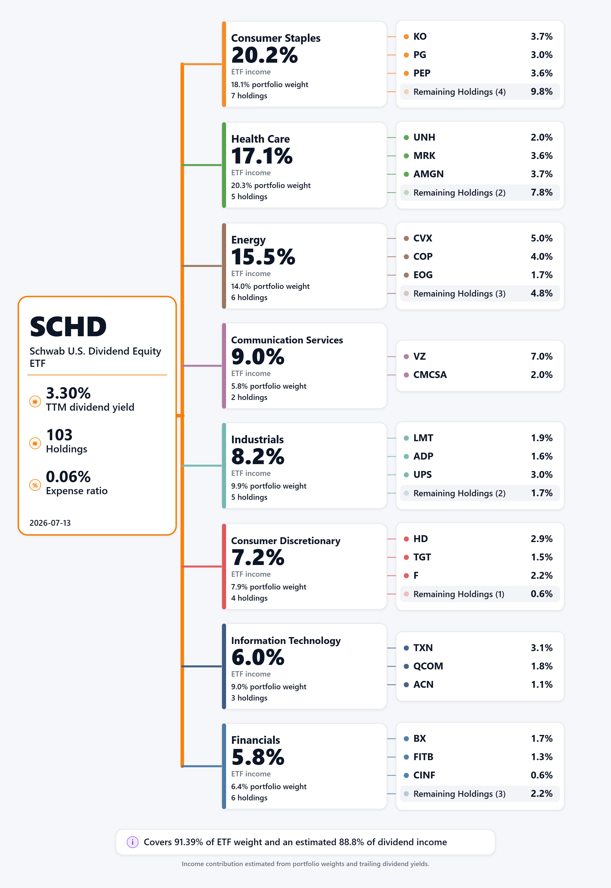
Rather than analyzing all 103 holdings equally, this visualization traces SCHD's estimated dividend income through its largest income-producing sectors and the companies within them. Together, the covered holdings account for more than 91% of the ETF's portfolio weight and an estimated 88.8% of its dividend income, providing a representative picture of where the fund's cash flow originates.
Consumer Staples stands out as the largest income contributor, generating an estimated 20.2% of SCHD's dividend income. Companies such as Coca-Cola, Procter & Gamble, and PepsiCo combine meaningful portfolio weights with attractive dividend yields, allowing the sector to produce a larger share of income than its allocation alone might suggest.
Health Care follows closely at 17.1%, supported by UnitedHealth, Merck, and Amgen, while Energy contributes 15.5%, driven primarily by Chevron, ConocoPhillips, and EOG Resources. These sectors demonstrate how higher-yield companies can significantly influence an ETF's income profile.
Information Technology tells the opposite story. Although it represents approximately 9% of the covered portfolio weight, it contributes only 6% of estimated dividend income because many technology companies pay relatively modest dividends compared with traditional income sectors.
Viewed together, the chart illustrates that dividend income is determined by both portfolio allocation and dividend yield. Understanding both provides a much clearer picture of how an ETF generates cash distributions than sector weights alone.
Final Takeaway
Sector allocation explains where an ETF invests, but it doesn't necessarily explain where its dividend income comes from.
Looking at portfolio weights alongside dividend yields offers a deeper understanding of an ETF's income engine and highlights which sectors and companies are doing the heavy lifting. For income-focused investors, this perspective can be far more informative than allocation percentages alone.