DIVO: Price Growth vs Distribution Growth
DIVO is usually viewed primarily as an income ETF, but income is only part of the picture.
For long-term investors, another important question is whether that income has grown while the underlying investment has also participated in capital appreciation.
Looking at DIVO from 2017 through 2025 shows an interesting combination: both its share price and annual distributions moved substantially higher, although the path of its distributions was far from smooth.
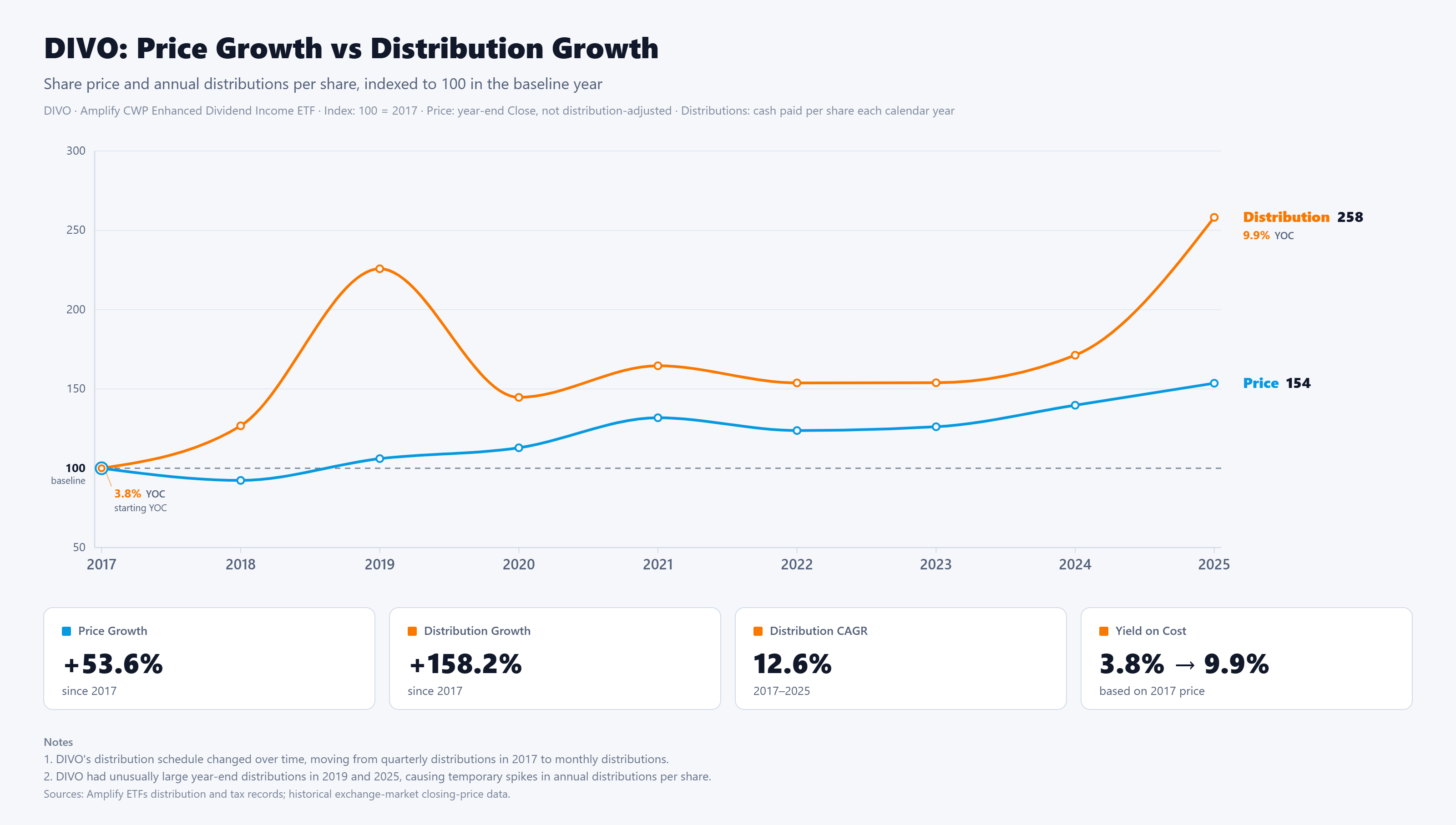
The chart indexes DIVO's share price and annual distributions to 100 in 2017, making it easier to compare how the two changed from the same starting point.
By the end of 2025, DIVO's share price had risen about 54%. That represents meaningful capital appreciation over the period for an ETF primarily designed around generating income.
Annual distributions grew considerably faster. By 2025, they were roughly 158% above the 2017 level, equivalent to about 12.6% annualized growth. For an investor who bought at the 2017 year-end price, that would have increased yield on cost from approximately 3.8% to nearly 10%.
However, the distribution line needs context.
DIVO's income growth was not consistent from year to year. Large increases in 2019 and especially 2025 were influenced by unusually large year-end distributions. Because DIVO's distributions include option-related income, they can fluctuate significantly.
That means the 12.6% annualized figure should not be interpreted the same way as a steady dividend-growth rate from a traditional dividend-growth stock or ETF.
The broader trend may be more informative. Even before the unusually large 2025 distribution, annual distributions had increased from roughly $1.11 per share in 2017 to around $1.90 in 2024. At the same time, DIVO's share price had also appreciated substantially.
Rather than showing a simple trade-off between income and capital growth, the chart illustrates how both components developed alongside each other over the period.
Final Takeaway
DIVO's history since 2017 shows why evaluating an income ETF requires looking beyond its current yield.
Its distributions have grown considerably from their starting level while its share price has also appreciated. But the income path has been uneven, and unusually large distributions can make headline growth rates look smoother or more repeatable than they really are.
For long-term income investors, the more useful question may be whether income is trending higher while capital continues to participate in market growth—not whether distributions increase at a perfectly consistent rate every year.
DividendXray visualizations make it easier to examine those two sides of an income investment together rather than evaluating yield in isolation.