Big Oil Dividends: Comparing Yield and Growth Across 7 Oil Giants
Big Oil is often treated as a single dividend category, but the income profiles of the world's largest oil companies can look surprisingly different.
This analysis compares seven global oil majors — Exxon Mobil (XOM), Chevron (CVX), Shell (SHEL), ConocoPhillips (COP), BP (BP), TotalEnergies (TTE), and Eni (E) — across three dimensions: market capitalization, forward dividend yield, and five-year dividend growth.
The result highlights an important trade-off for dividend investors. Company size, current income, and historical dividend growth do not necessarily point toward the same stocks.
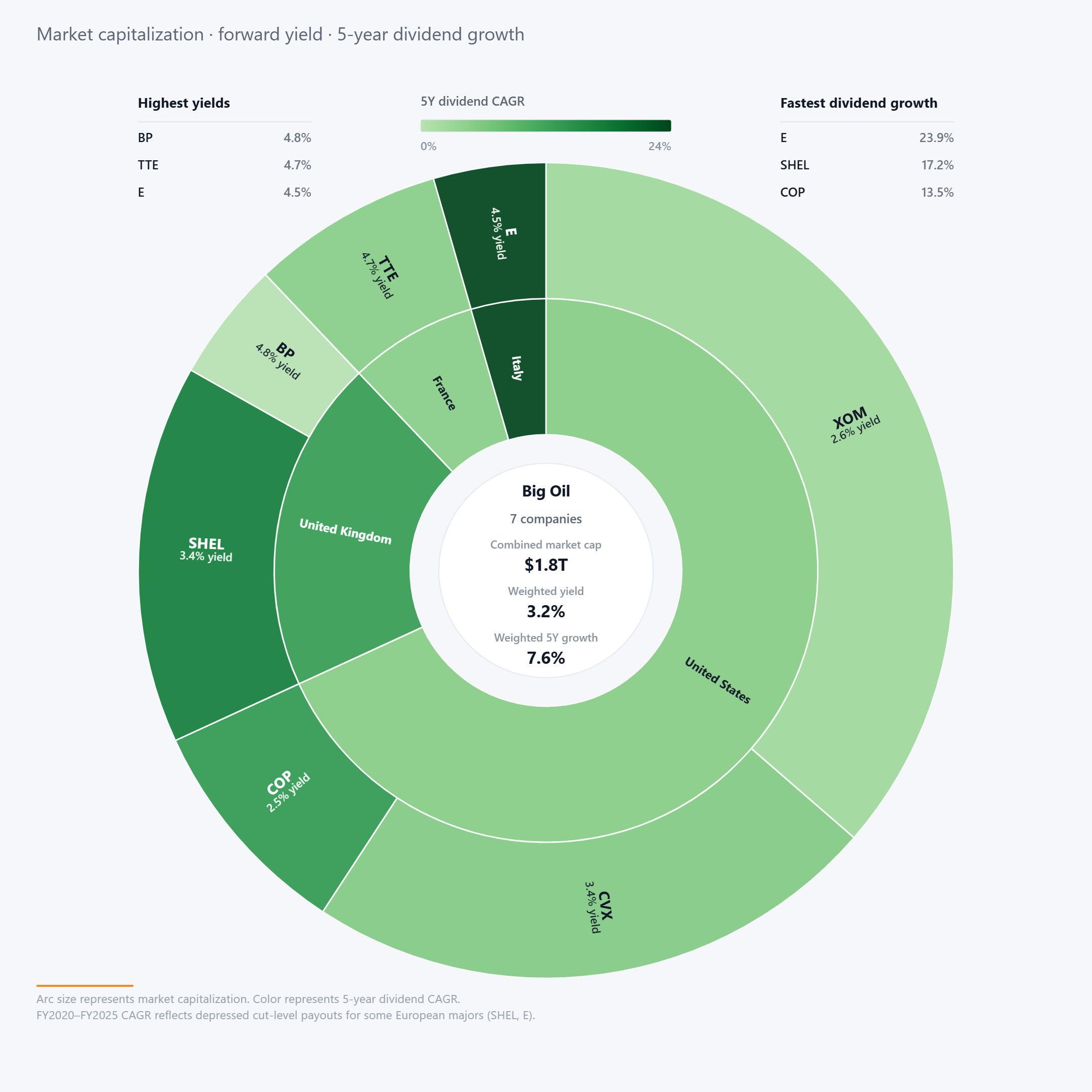
The chart uses slice size to represent market capitalization and color to represent five-year dividend CAGR, while each company also displays its forward dividend yield.
On current income, the European majors stand out. BP leads the group with a 4.8% forward yield, followed by TotalEnergies at 4.7% and Eni at 4.5%.
Dividend growth tells a different story. Eni has the fastest five-year dividend CAGR at 23.9%, followed by Shell at 17.2% and ConocoPhillips at 13.5%.
Those growth rates require context, however. The CAGR period covers FY2020 through FY2025, and some European majors cut their dividends during this period. As a result, part of the strong subsequent growth reflects recovery from depressed payout levels rather than a steady long-term growth rate.
Market capitalization adds another dimension. Exxon is the largest company in the comparison, followed by Chevron, giving the U.S. oil giants a large share of the group's combined $1.8 trillion market value.
Their current yields are more modest than those of several European peers. Exxon yields 2.6%, while Chevron yields 3.4%.
Across all seven companies, the market-cap-weighted forward yield is 3.2%, while weighted five-year dividend growth is 7.6%.
The visual therefore does not produce a single obvious winner. Instead, it shows how differently companies within the same industry can balance scale, income today, and the recent trajectory of their dividends.
Final Takeaway
Big Oil may look like a relatively uniform dividend sector from the outside, but these seven companies offer meaningfully different income profiles.
Higher current yield does not automatically mean stronger dividend growth, and unusually high historical growth rates need to be viewed in the context of previous dividend cuts. Market capitalization adds another layer: the largest companies in the group are not necessarily the highest-yielding ones.
For dividend investors, the practical takeaway is to look beyond sector labels and headline yield. Current income, dividend history, growth trajectory, and company scale can tell different parts of the story.
DividendXray uses visual analysis like this to make those differences easier to see and compare.